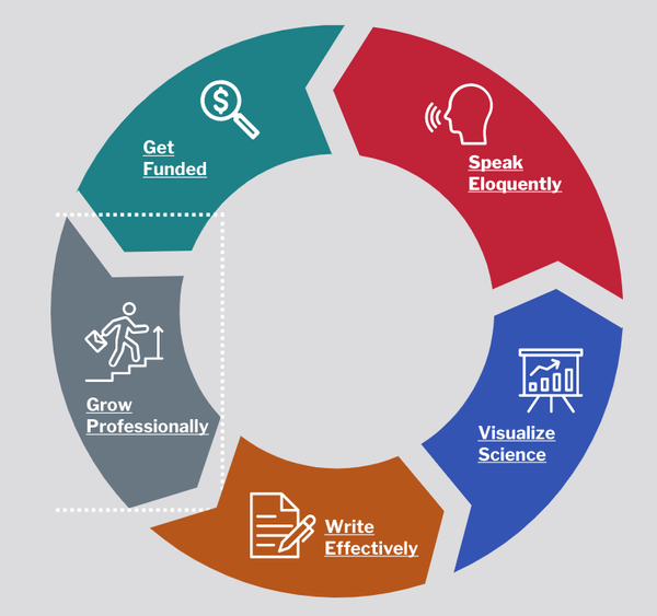
A few months ago, a client requested a clickable diagram for their website. Upon looking at the PNG image they sent, I realized the best way to make it accessible was to convert it into an SVG and add the links around each section of the diagram. Through the process of creating and testing this diagram, I learned a few new things about accessibility. Some of them were obvious, but others were a bit harder to uncover.
Order Matters
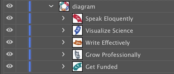
The proper tab order is both accessibility and usability essential. Having the appropriate tab order on a web element allows someone using a keyboard for navigation to go from one section to the next easily. To achieve the correct tab order while working on Illustrator, place the group you’ll want to tab into first at the bottom of your layers list. When you export a file as an SVG, the bottom layers will appear first on the tab order.
My SVG had 4 linked areas, and I wanted users to tab through the SVG in the following order:
- Get Funded
- Grow Professionally
- Write Effectively
- Visualize Science
- Speak Eloquently
Therefore I needed to order my grouped layers in the following way:
- Speak Eloquently
- Visualize Science
- Write Effectively
- Grow Professionally
- Get Funded

Text layers export as <text>
Screen readers should be able to read the text in SVGs to aid vision-impaired users.
Therefore text needs to be wrapped in a <text> tag. If you use the text tool and don’t flatten the layers, the SVG will export with <text> tags.
SVGs don’t always export perfectly
After exporting my file into an SVG, I opened it in a text editor to add links around components. I thought this process would be straightforward but noticed a few issues with the code.
Tags brake up text
Some words, such as “Grow” and “Professionally,” were broken up by <g> tags. At first, I wasn’t sure if this was an issue or not, so I decided to test my SVG with a screen reader. I opened my SVG on a browser and tested with ChromeBox, a screen reader extension with Chrome. My test revealed that the pesky <g> tags were interrupting the reading flow of screen readers.

I’m not sure if there is a way to avoid unnecessary <g> tags while working on Illustrator, so if you do, let me know! I made sure to fix the issue by removing the <g> tags in between letters.

You need a descriptive title
Accessible SVGs have a descriptive <title>. When you export the SVG, the <title> will be the name of your file. “Catalyst-Lifecycle-Diagram,” didn’t describe the contents of my SVG. Therefore I had to change the contents within the <title> tags.
Semantically named layers make easy to read code
The names you’ll use in your layers will be the IDs on different <paths> in your SVG files. Naming the layers will make it easier to read the SVG text file for clean-up.
::focus on the right element
After placing the SVG on the website, I tabbed through it to ensure everything worked as expected. I discovered that the ::focus style on the element wrapped very far from the SVG text. This behavior made sense. I had placed each <a> tag around a group of elements that made up one section of the SVG. The “Grow Professionally” component didn’t only consist of text. It consisted of an arrow shape, an icon, and the text. Therefore the link needed to be around a group of elements.

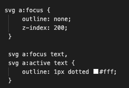
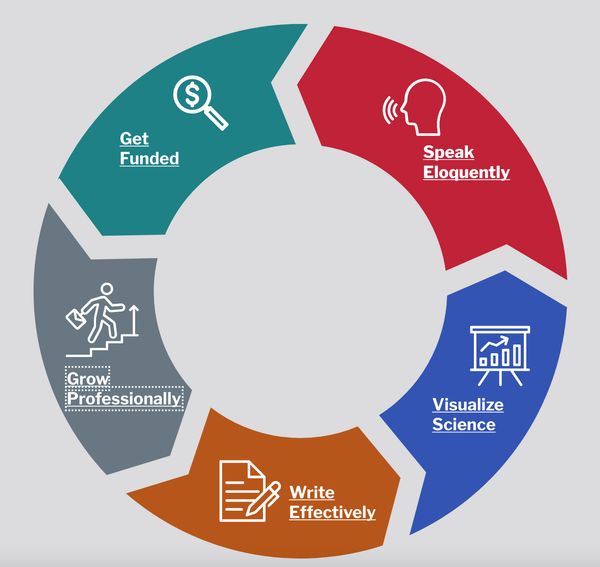
While technically correct, the ::focus style was a bit confusing from a user perspective. It wasn’t clear what they were clicking and where it would take them. It also looked awkward, as it was being cut off by the SVG's container. To solve this issue, I used CSS to make sure the focus appeared around the <text> tags.


Closing thoughts
Accessibility is a complex topic, and there is much more to cover for accessible SVGs. However, because SVGs are considered such a complex topic, much of the information about SVG accessibility is too involved and provides little help for someone working on a small project. Hopefully, this article makes accessibility just a little bit easier to implement for someone. If you have resources with a similar goal that you’d like to recommend, or if you have questions about my experience, I’d love to hear from you.