Project Overview
Summary
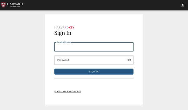
I conducted a moderated usability study for a prototype version of HarvardKey 2.0
Team & Timeline
1 month start to finish, with a 3-person team working remotely.
Responsabilities
Tools
- Zoom
- Google Sheets
Outcome
Findings created alignment around final changes, and HarvardKey 2.0 successfully launched 2 months after testing.
Problem and Context
In 2019 the Harvard Identity and Access Management team began a project to improve the login experience of people who only needed access to Harvard resources for a short time, such as a one-semester course. These individuals were using an authentication system called XID, while those with longer-term relationships with Harvard used a system called HarvardKey. The exploratory research of this project led to the decision that Harvard needed a complete redesign of the existing login system called HarvardKey. This system needed both to incorporate those with a short-term relationship with Harvard and have an upgraded UI, making it easier for anyone related to Harvard to create their HarvardKey account and update their information. For 2 years, IAM iterated over the design of HarvardKey 2.0, and in April of 2021, it became ready for usability testing before its official launch.
The Team
The HarvardKey 2.0 team started from high leadership in Harvard. However, the core teams working in the project consisted of: the UX Strategy Lead at the Harvard Enterprise UX team, the Harvard Web Publishing (HWP) UX team, the Harvard Digital Accessibility Team (DAS), and the Harvard Identity and Access Management team (IAM). For the most part, I worked closely with 2 members of my team, HWP, and we reported research findings to IAM.
What I did
Usability Testing
During testing, we wanted to answer the following questions:
- Are users able to perform the following standard authentication tasks efficiently and easily?
- Create an account
- View their profile
- Change the name and on their profile
- Log in
- Reset their password
- Do they understand the content and process of the authentication emails?
- Is there anything confusing about the language and labels?
- Are there any blockers or pain points?
The HWP conducted 30-minute Zoom sessions with 13 participants to answer these questions. Unfortunately, because potential users had short-lived relationships with Harvard, we had difficulty connecting with many of them. Therefore, 10 participants were people who had experience working with or providing authentication support to potential users.

Research Analysis
I created a modified version of Tomer Sharon’s Rainbow Spreadsheet to analyze the data. This method allowed the team to watch recordings and take notes collaboratively and asynchronously.
Sharon’s note-taking tool is a go-to for HWP. It works similarly to an affinity diagram but allows us to combine qualitative and quantitative information. While our small participant pool would not yield reliable quantitative data, placing numbers around observations could help us prioritize findings.
Although we found the tool helpful, I found that certain aspects of the sheet didn’t fit our workflow. For example, on a typical Rainbow Spreadsheet, each participant is assigned a color. This color marks if the participant performed an action noted in the Observations column. But we often found it more beneficial to see patterns per audience and not per participant. Therefore I decided to use a color per audience segment. I also added a column that calculated how many users had performed an observation.

Reporting Findings
We presented our results to the IAM team through a deck, in which we prioritized three areas of improvement.
1. Easing password creation
The IAM team had little room for making password requirements less strict. But most users struggled to create their passwords and did not understand the need for so much complexity. We discussed how we could make password creation less of a burden. One suggestion we made was to make sure validation happened in real-time and not once the user removed their cursor from the text-input field. I also suggested re-designing the layout of the password requirements so that instead of paragraphs, it used a bulleted list for improved scannability.
“Oh this is confusing. You can’t use words with five or more characters...I haven’t seen that before”
Administrative staff, HUIT

2. Avoiding dead ends
During our usability test, we observed that after users changed the name on their profile, they did not immediately know how to get back to the profile page to verify the change. To solve this problem, I recommended adding a “View Profile” button immediately below the Name Changed confirmation message and emphasized the importance of avoiding dead-ends overall.
“I would say, the only point of confusion was after I changed something, where should I go next?”
XID User, IAM

3. Providing context and consistent branding around HarvardKey
A few participants mentioned that from their experience, the term “HarvardKey” might be foreign to someone outside of Harvard. I, therefore, suggested using the word “account” in the account creation key to indicate the meaning of HarvardKey. Furthermore, we heard a few users mention that the unbranded emails they received were easy to read but seemed outdated and somewhat unreliable because they had no Harvard branding. Thus we recommended adding the HarvardKey logo to the emails.
“As a new user, I'd like to know what HarvardKey is, what its used for...just some context”
Admin, GSE IT

Impact
Testing helped create priorities and alignment about final changes to the HarvardKey 2.0 interface.
In July 2021, HarvardKey 2.0 successfully launched with the testing recommendations. It is currently still in use by all Harvard community members.
